
Digital marketing designs for education center
December 28, 2024
World Education Fair
May 18, 2023Logo redesign for MKB UnionBank
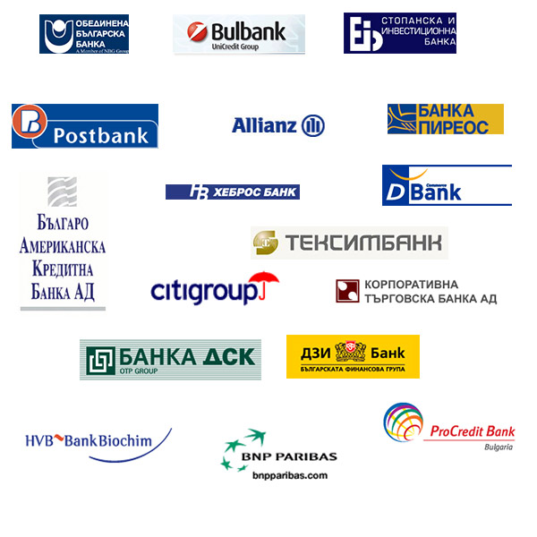
This is a project from participation in a competition for the redesign of the bank's logo.
Project created in 2007.
A logo for a bank should possess several key characteristics to effectively represent the institution's brand identity and establish trust among customers. Here are some important characteristics of a bank logo:
-
Simplicity: A bank logo should have a clean and simple design that is easy to recognize and remember. Avoid using overly complex or cluttered elements.
-
Professionalism: Since banks deal with people's finances and are expected to be reliable, the logo should convey a sense of professionalism and trustworthiness. Use clean lines, balanced compositions, and appropriate typography.
-
Distinctiveness: The logo should be unique and distinguishable from other banks to create a strong brand presence in the market. It should stand out and be easily recognizable among competitors.
-
Symbolic Representation: Incorporate visual elements or symbols that relate to finance, stability, growth, or trust. For example, you might consider using abstract shapes, currency symbols, columns, or other relevant icons to represent the bank's values and services.
-
Color Palette: You may choose colors that evoke feelings of trust, security, and stability. Blue is commonly associated with trust and reliability, while green can represent growth and prosperity. However, different colors may have different cultural associations, so consider the target audience and local preferences.
-
Scalability: Ensure the logo can be easily scaled up or down without losing its clarity or legibility. It should be adaptable for use on various marketing materials, including websites, signage, mobile apps, and promotional merchandise.
-
Timelessness: Aim for a logo that will remain relevant and timeless for years to come. Avoid trendy design elements or fonts that may quickly become outdated.
-
Typography: Choose a typeface that is legible and professional. Serif fonts can convey a sense of tradition and stability, while sans-serif fonts often appear modern and clean. Find a balance between readability and style.
-
Versatility: The logo should work well across different mediums and backgrounds. Ensure it is effective in both color and grayscale formats, and consider how it will appear in both print and digital applications.
-
Consistency: Once the logo is established, maintain consistency by using it consistently across all marketing materials, including websites, advertisements, stationery, and social media platforms. This helps reinforce brand recognition.
Remember that designing a logo involves a combination of artistry, psychology, and understanding the bank's values and target audience. It is often helpful to work with a professional graphic designer or branding agency to ensure the logo effectively captures the essence of the bank's identity.